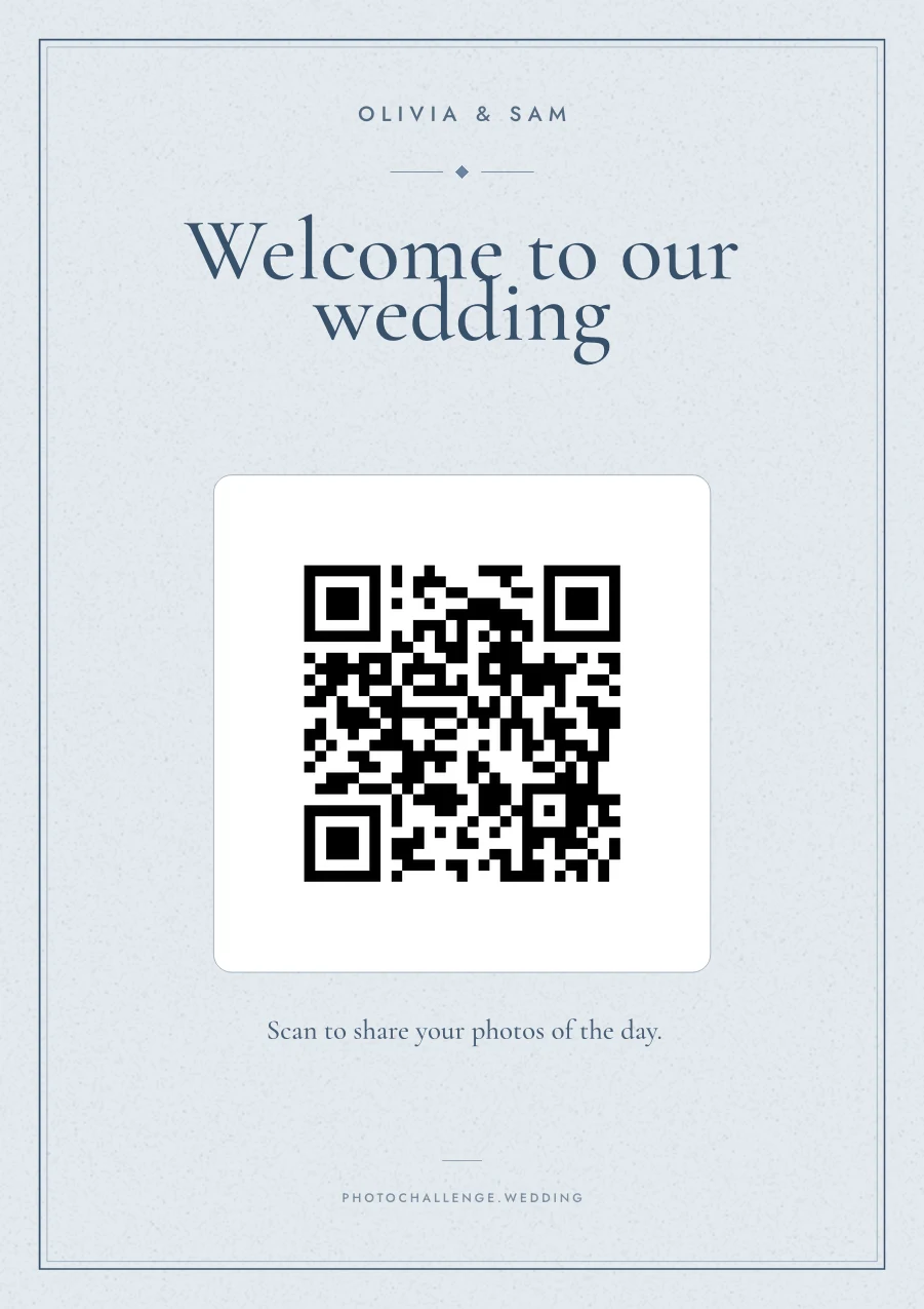
Wedding stationery — papeterie, as it's called in much of Europe — starts with the save-the-date and ends with the thank-you cards, but most of it lives on the day itself, on signs. They point the way, tell guests where to sit, explain the bar, and quietly say a lot about the two of you in the background of every photo. Below are 20 sign ideas with the size each one needs, then how to make every piece look like one set.
20 wedding sign ideas
Pick the ones your day needs; few weddings need all twenty. Sizes are what works in most venues: big signs on an easel are usually A2 to A1, or 18×24 in; table signs A5 or 5×7 in a stand.
The essentials
- Welcome sign with your names and the date, at the entrance (A2–A1). The sign in the most photos.
- Seating plan, large and legible; sort it alphabetically above about eighty guests (A1 or bigger).
- Table numbers or names, readable from the door (A5 or 5×7).
- Order of the day: ceremony, drinks, dinner, first dance, cake (A3).
- Bar menu or signature drinks (A4).
- Cards and gifts, next to the box or table (A5).
For the ceremony
- Unplugged ceremony: We'd love to see your faces, not your screens (A3, at the entrance).
- Choose a seat, not a side, for a ceremony without assigned sides (A3).
- Order of service or a short programme (A3, or small cards on the seats).
- Reserved signs for the front row (small, on the chairs).
- Here comes the bride, or the groom, carried down the aisle by the youngest guest.
For the guests
- Guest book sign, telling guests what to do with it (A5).
- Photo sharing or photo challenge: one QR code and one line, scan to add your photos (A4 at the bar, table cards on every table).
- Wifi name and password, if the signal is weak (A5).
- Favours: take one, with love (A5).
- Hashtag or photo booth sign, next to the booth (A4).
- In loving memory of family who aren't there, with photos or a chair kept free (A4).
- Directional signs to the ceremony, the bar, the dance floor and the toilets, at a large venue (A3 arrows).
For the evening
- Late-night snack sign, or the food-truck menu (A4).
- Send-off sign for sparklers, bubbles or confetti: grab one for our exit (A5).
Start every sign from one palette
Take your colours from the invitation, not the other way round: it's the piece most guests have already seen. A palette that works on paper usually has three parts:
- A background: a warm white, cream or soft stone rather than a bright white. Pantone named Cloud Dancer, a soft white, its Colour of the Year for 2026, and the mood suits wedding paper well.
- An ink: a deep colour for the text, such as charcoal, navy, deep green or burgundy. It needs strong contrast with the background so a sign reads from across the room.
- One accent: a colour from the flowers or the bridesmaids' dresses, for a line, a monogram or a small motif.
Then use exactly those three, everywhere. A sign in the wrong pink is the thing guests' phones catch in every photo.
Pair two typefaces, not five
One display face for names and headings, one text face for everything you need to read. A few pairings that work well together:
- A classic serif on its own, like Cormorant Garamond, in two weights. Elegant and very hard to get wrong.
- A high-contrast serif with a book serif, like Playfair Display with EB Garamond. Romantic, and very legible.
- A script for the names only, like Great Vibes, with a quiet serif for the rest. Never set a whole menu or seating plan in script.
- A geometric sans in capitals, like Montserrat, widely spaced, for a modern, gallery-like look.
Whatever you choose, check it from a distance: a delicate typeface that's beautiful on an invitation can disappear on a sign three metres away.
Paper, boards and finishes
- Weight: 300gsm or heavier for anything that stands up; 160–200gsm is fine for menus and small cards. Anything under 120gsm feels like a printout.
- Foam board or acrylic for the big signs on an easel; a print shop can mount a poster print on foam board for much less than a custom acrylic sign.
- Matte, not gloss. Gloss reflects the lights in the room, which makes signs hard to read and QR codes hard to scan.
- Textured or cotton paper looks lovely in photos and takes ink well; ask your printer to proof a QR code on it.
- Foil and letterpress: beautiful for names and monograms. Keep them away from QR codes, where shine and indentation can stop a phone reading the code.
- Vellum overlays: a pretty layer on invitations, but never over a QR code.
Designing a QR sign guests can actually scan
QR codes are now on menus, signs and photo-challenge cards at many weddings. A few rules make the difference between a code that scans on the first try and one guests give up on:
- Size for the distance. A common rule of thumb is about one centimetre of code for every ten centimetres of scanning distance: around 3 cm for a card on the table, 15–20 cm for a sign across the room.
- Dark on light. Print the code in a dark ink on a light ground. Inverted codes and low-contrast colours fail on older phones.
- Leave a margin. Keep a clear border around the code; don't run a frame, a flourish or a photo right up to its edge.
- Say what happens. One line next to the code — scan to add your photos — gets far more scans than a code on its own.
- Test it in the room. Scan your printed proof with an older phone, in the lighting of the venue, from where guests will stand.
Matching a photo challenge sign to your stationery
If you're running a photo challenge, its cards or sign are part of your stationery too. In the PhotoChallenge designer you choose:
- A palette from nine, from warm sand and dusty blue to burgundy and noir & gold.
- A typeface pairing from six, including the classic serif, romantic, script and gallery looks above.
- A paper size: A4, A5, US Letter, 5×7, square, a 10×15 photo print, or a business-card-sized table card printed eight to an A4 sheet.
- Your own title and instruction.
The preview is rendered from the same template as the PDF, so what you see is what prints. The QR code always sits on a light tile, so it scans whatever palette you choose. For printed cards, there are five designs to match common wedding palettes; see the cards guide.
Working with a stationer or a template you already have
If a stationer is designing your day, or you've bought a template on Etsy or made one in Canva, you don't need our design at all: on a paid plan your event page has Download QR code (PNG), so the code can go straight into their artwork. Ask for a proof with the real code on it, scan it before the full print run, and keep the rules above — matte, dark on light, a clear margin — in the brief.
Frequently asked questions
What signs do you need at a wedding?
Most weddings need a welcome sign, a seating plan, table numbers, an order of the day, a bar or drinks menu and a cards-and-gifts sign. Common extras are an unplugged-ceremony sign, a guest book sign, a photo-sharing QR sign, a favours sign and an in-loving-memory sign.
How big should a wedding welcome sign be?
Big enough to read from a few metres away: usually A2 to A1, or 18×24 to 24×36 inches, on an easel. Table signs and numbers work at A5 or 5×7 inches in a stand.
How do you make wedding signs and stationery match?
Use one palette of two or three colours taken from the invitation, one display typeface and one text typeface, and the same paper finish for every piece on the day, from the welcome sign to the table numbers.
What paper is best for wedding signs?
A heavy matte card, 300gsm or more for anything that stands up, or a matte print mounted on foam board for the big signs. Matte avoids reflections from the venue lights, which matters for readability and for QR codes.
How big should a QR code be on a wedding sign?
About one centimetre of code for every ten centimetres of scanning distance: roughly 3 cm on a table card, 15 to 20 cm on a sign across the room. Print it dark on light with a clear margin.
Can I put a QR code on signs I've already designed?
Yes. On PhotoChallenge's paid plans you can download the QR code as a PNG and give it to your stationer, or drop it into an Etsy or Canva template.
Design a sign that matches your day
Nine palettes, six typeface pairings and a live preview that's exactly what prints. The test run is free for up to 5 prompts.
Design my sign